Platinum 3776 Century Chartres BlueNib Soft Fine
Platinum #3776 Century Review
This is my second review, so please let me know what you think in the comments. Also, there is a review of the Medium version of this pen in Bourgogne, so stay tuned for that.
Table of Contents
- Introduction
- Packaging
- Form Factor and Appearance
- Nib and Section
- Conclusion (TLDR)
Statistics
· Name: Platinum #3776 Century
· Nib: 14k gold fine nib
· Country of Origin: Japan, imported to US
· Model Number: PNB-10000#51-F
· Color: Chartres Blue
· Price: ¥10,000 retail. Available in the U. S. for ~$150, and from importers for $70
· Included Items: Box, warranty papers, manual, cartridge
Part I: Introduction and History
In 1919, Shunichi Nakata a Japanese industrialist, founded the Nakaya seisakusho (which according to the company's website means 'Nakata: manufacturer of fountain pens,' in Tokyo, Japan. Nearly a decade later, in 1928, Nakata changed the name to the Platinum Fountain Pen company. In 2011, eight years prior to Platinum's centennial, the company announced the Platinum #3776 Century fountain pen to commemorate the company's nearly century long existence. The name of the pen comes from the height of Mount Fuji (in meters). This happens to bear very strong resemblance to the Montblanc Meisterstuck pens, which have the number 4810 (the height of Mont Blanc in meters) embossed on their nibs.
The pen also serves as an ambassador, of sorts, as one of the most well-known introductory 14k gold nib pens, along with the Pilot Custom 74 and Sailor Profit 1911 series. It is also an excellent pen overall, and with its street price of $70, it is a brilliant value. The pen is also available with excellent variety, as it is available in eight nib options–UEF, F, M, B, C (double broad), SF, and Music. Its inexpensive price, high build quality, and pleasant writing experience make it one of the most popular fountain pens in the world and one I recommend immensely.
<sidenote>
Over the past five years, Platinum has come out with a multitude of Limited Edition Centuries to augment the permanent collection of black with gold trim, Chartres Blue with either gold or rhodium trim, and Bourgogne with gold trim. The limited edition pens are contained within two categories, those named after cities, and the 'Fuji Lake Collection'. There are three limited edition pens named after European cities and neighborhoods—the Nice (which was announced in 2013 and named after the city on the South of France), the Nice Pur (identical to the Nice except for silver accents instead of rose gold), and the Nyhavn (which was announced in 2015 as an Engeika excusive; it was named after the entertainment district in Copenhagen). The Nice pen is clear, with a somewhat clouded resin and rose gold accents. The Nyhavn pen, on the other hand, is much more audacious in design as it has a yellow cap and section along with a rose gold barrel, nib and accents. There are also five 'Fuji Five Lake Series' pens: the Mostu (2011, clear resin) Shoji (2012, light blue transparent resin), Sai (2013, clear resin), Yamanaka (2015, clear textured resin), and the final just recently announced Kawaguchi pen (2016, textured blue translucent resin with silver accents).
</sidenote>
Part II: Packaging (85/100) Functional, could be nicer
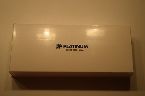
The pen arrives very well packaged. The exterior box is white, with the Platinum name and logo printed on the front. On the back of the box are Japanese recycling notifications. The actual box of the pen is very similar to those Sailor uses in pens of a similar price range. It is plastic and covered in a faux-leather material that is actually quite pleasant. There are no markings. Once opened, the platinum logo in stitched in gold thread. The rest of the box uses a satin-like white material. The pen sits in a plastic sleeve with a clip-card providing its model number. This is all tucked under a little white ribbon to keep it from moving too much in transport. Unlike, for example, the Pilot box, the base of the Platinum packaging is glued in place. The packaging feels rather brusque. Although Platinum would like to believe that you would leave it on your desk, it is really just something you'll probably put in a drawer. It will get the pen from A to B safely, but it's design leaves a little to be desired.

Depending on the reseller, the Pen may or may not come with a Platinum converter. As my pen was a Japanese import, it did not, however, I was able to secure one rather inexpensively from the same seller on Rakuten. In the box (in all cases), comes the pen, an instruction manual, and a warranty card. It also comes with one cartridge of Platinum pigment ink. In some cases, it comes with the blue ink, and in other cases (such as mine), it arrived with blue-black ink.
Part III: External Form Factor & Appearance — 95/100
The pen is a classical cigar shape with a nice diameter and tapered cap and finial. It is also rather light, being roughly 21 g without ink. It owes this to its plastic construction, which unlike some of its cousins (such as the Pilot C74), does not feel cheap at all. Rather to the contrary, the pen is solid in the hand, with a perfect and weight and measurements to be a lightweight everyday writer.

Capped, the pen measures 14 cm long (the cap itself measures 6.7 cm). Uncapped, the pen measures 11.7 cm. The barrel is exactly 8 cm, and the nib and section measure 3.7 cm. The nib itself takes up a majority of the section, measuring 2.2 cm while the section itself measures a comparably small 1.5 cm. However, the writing are is rather large at 2.5 cm long as the threads on the barrel are not sharp and can be used as a grip quite easily. If you prefer to hold your pen higher, the step between the threads and the rest of the barrel is quite small. The pen has a very comfortable diameter of 1.2 cm. Compared with the Pilot C74, which has a 1 centimeter diameter, it is far more comfortable for long periods.
During one of my exams two weeks ago, I used this pen to write a seven-page essay, and I can affirmably say that the pen is extremely comfortable. My hand always felt at home on the grip, and it barely even got tired.
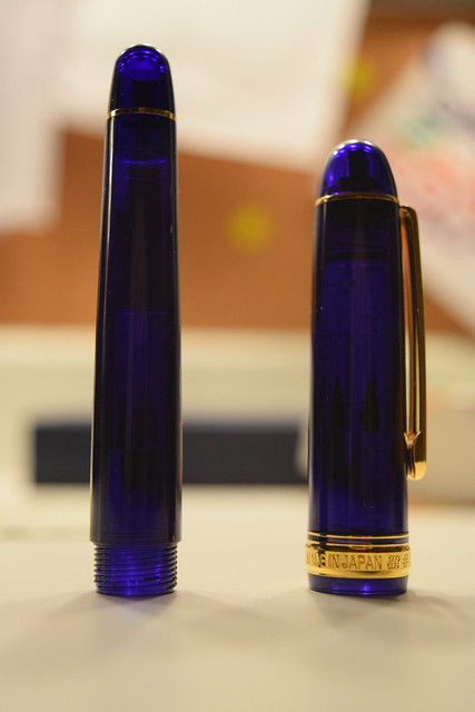
The pen is made out of strengthened PLA plastic, and when looking at the pen for the first time, you will notice that it is truly beautiful. In the case of the Chartres Blue model, the resin is a rich blue color, with just a touch of translucency. It is really something that you have to try for yourself in order to truly understand, and when you do experience it, it is a sight to be seen. The gold accenting around the clip fit in very well with the resin color and only serve to make the instrument look even better than it already does. However, the resin is a bit more prone to scratching that the Custom 74, due to it sustaining a little scratch after a drop onto hardwood flooring.
<sidenote>
The pen's color is called the 'Chartres Blue' model because it is based off of the stunning blue stained glass windows of the Chartres Cathedral in Chartres, France. The stained glass windows in the cathedral are known for their deep, rich, blue color, and I think that Platinum did an excellent job emulating that in their pen.
</sidenote>
The clip is a rounded rectangle sharper angles on the top. It is connected to the cap by a small gold pen, very similarly to the Pilot C74. Near the bottom of the cap are two bands. One thicker, raised band at the bottom which says '#3776 PLATINUM MADE IN JAPAN,' and one thinner band right above it.
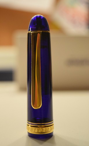
The cap screws on in 1¾ rotations. However, this cap has Platinum's 'Slip and Seal' feature which is essentially a smaller, airtight cap that secures around the nib and feed, keeping the ink from drying out. When screwing the cap onto the pen, you can feel the mechanism engage in the final quarter turn. Platinum claims that the pen can sit for two years with pigment ink, and upon your first usage in two years, Platinum claims it will start without hesitation. Although I have only had this pen for a matter of weeks, much less years, I have not been able to test this. However, I can say that it has not hard-started once in my possession.
The pen also posts quite well. Posted, the pen still remains balanced, however, if you have small hands, it could feel slightly back-heavy. I personally prefer it unposted as it is extremely well balanced no matter your hand size.
The pen's build quality is also top-notch. Never, in my possession, has it creaked or cracked. Although it is made of plastic, the resin feels solid and the pen benefits from its lightness. In comparison to the Custom 74, the pen just feels a little more professional. It weighs a bit more, and it feels like more of a writing
Part IV: Nib, Section, and Writing (95/100)
The section on the Century is simple, but comfortable. It is 12 millimeters in diameter, and 1.5 cm long. However, the threads on the barrel are not sharp, and extend the usable grip space by another centimeter. There is a gold band on the end of the section that shows where the section ends and the barrel begins. It also has a little lip at the end to keep your hands safely away form the nib.
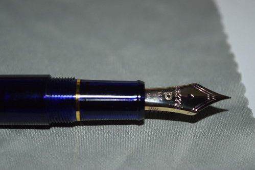
And that brings me to the nib, the defining feature of any pen. This pen is no exception. From a visual standpoint, the nib is rather plain, albeit rather large. It has the Platinum logo, an indicator for nib size and the text 14k and 585, signifying that the nib is 58.5% gold. The word 'Japan is etched into the right side of the nib'. The only bit of decoration on the nib is that of an etching of Mount Fuji that is simple and tasteful. Below that is the number 3776, signifying the mountain's height. It also has a breather hole that looks like a heart that I really like.
From a design perspective, however, the nib is a little more interesting. It is very broad shouldered, allowing less line variation in the writing. It is also very large. These two factors make the nib hard as a nail when writing normally, but somewhat flexible (not as much as an sf nib), when you try to create variation.
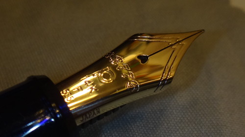
As said above, under normal conditions, this nib is very stiff. It will not give an inch unless you press down. However, if you do press down you will most likely punch through your paper because the fine nib is really quite fine, for a fine nib, (and pointy). It is finer that my other Japanese fine nibs and is a hair finer than a Jowo EF or a Lamy EF. Due to this, the pen also gives a fair amount of feedback. In the beginning, the pen may even border on scratchy. However, once your break the nib in, it gives enough feedback so that you can hear it write and you can feel the paper under you. It is definitely not smooth, though. If you prefer smooth, I would recommend you try the Medium nib in this pen, which is very, very smooth (review of that model is coming soon).
The pen writes rather neutrally, the ink really determines if it is smooth or dry. So far, I have found that well-lubricated pigment inks, such as the Sailor Blue-Black I currently use with it, suit it the best. The feed has never clogged or hesitated and can write just as fast as I can. I am confident that this pen will be able to write whatever I need it to. If you can deal with a slight amount of feedback, the nib is pleasure to use.
 Writing sample on 90g Rhodia
Part V: Conclusion (TL;DR) — 275 / 300: 92% — Very well recommended
Compared to the Pilot, the Platinum is not a pen for fancy, ornamented writing. It is really more of a workhorse device. It is extremely capable, and can deal with pretty much everything I can throw at it. As a student, it is a perfect pen as its fine nib (coupled with the right ink), bleeds through very little, while providing a nice, steady, fine line. It is built well, and very comfortable to write with for long periods. I recommend it highly.
Thanks for reading,
Caleb
Edited by caleb
Source: https://www.fountainpennetwork.net/forum/topic/309867-platinum-3776-century-chartres-blue-fine-review/
0 Response to "Platinum 3776 Century Chartres BlueNib Soft Fine"
Post a Comment